Our tendency to prefer things we are familiar with poses serious challenges to innovators trying to bring new things into people’s lives. How can we instil familiarity into the unfamiliar?
We are humans and we love routines. In fact, our brain is trying to save energy at any possible opportunity by creating habits that when established help us minimise the time and energy necessary for certain tasks, such as brushing teeth, or navigating to work, and free up time for more important things such as finding new ways to startle our pets or making our spouse smile.
Our brain energy-saving nature plays a role also when we encounter something new, such as a new person. Our tendency to prefer and feel closer to people of our culture, language, religion or background comes from this simple truth: surrounding us with like-minded people requires way less energy than having to relate to someone very different from us.
This same mechanism applies to things as well. In fact, we are more likely to understand and easily relate to familiar products rather than unfamiliar ones. The shape, material and interaction paradigm of a product will all contribute to create a perception of it in our mind, that in turn will evoke an emotional response.
As design is the art of innovation, that by definition is about creating something new, as opposed to tradition, that is about re-proposing over and over again the “same old soup”
“How can we create disruptive products and services while maintaining a feeling of familiarity in them?”
METAPHORS & ANALOGIES
A powerful way to instil familiarity in unfamiliar solutions is by using metaphors and analogies.
In over ten years of design career living and working in three different continents I used these tools in all the projects I worked on to achieve a wide variety of goals. In the next paragraphs I will provide some examples of how metaphors and analogies can help creating meaning around new technologies, changing perception over tricky product categories, making products understandable and instilling positive emotions into products and services.
1 / Giving meaning to technology
A first good example of using metaphors in design is Helios, a robotic lamp I designed in 2007-2009 while at Alta Scuola Politecnica. The project goal was to investigate meaningful applications of robotics in the home environment. The resulting concept was a unique use of gesture recognition in a consumer device (a desk lamp), years before Microsoft Kinect was first introduced.
“Helios humanises the way we interact with light through a simple metaphor: being able to ‘touch the light’ and shape it according to our needs.”

A smart cam, integrated in the head, monitors hand gestures and changes light parameters accordingly. For example, the light intensity can be dimmed with a vertical movement of the hand, while the spot can be enlarged or shrunken with a zooming gesture. Even the light colour can be changed by moving the hand in a circular gesture.
This powerful story, combined with a consistent product experience won the heart of Alessandro Mendini, who included Helios in Milan Triennale Design Museum collection, and brought the team a patent and a couple of awards.
2 / Change common preconceptions
Metaphors and analogies are powerful tools not only to make new products meaningful but also to change a negative reputation affecting a whole product category.
In 2016 I was approached by an Asian brand to design a new adult toy collection that could compete with their more famous European competitors. I was faced with a tricky challenge:
“turning adult toys from taboos to something to positively embrace.”
The outcome was Les Stones, a collection of couple-oriented toys to be used by both to reconnect to each other.

“Their distinctive pebble shape leverages on the analogy with hot stones, typically associated to relaxing massages. The analogy extends to the way the user stores and charges the stones, by piling them as in a zen garden, and to the integrated warming functionality that enhances the sensual massage experience.”
This results in a perception shift of the product that suddenly seems more approachable, inviting experimentation and play.
3 / Make a product understandable
Perhaps the most straightforward application of metaphors and analogies in design is to help users understand how a product works. A good example of this is the product experience behind Urban Oasis, a gardening kit I designed during my period in Shanghai.
As the metaphoric name denotes, the idea was to create a kit that would help people reconnect to nature in the urban environment, by growing vegetables at home. To overcome the typical mismatch between instructions and product of most gardening kits, we decided to merge the two by creating a fun step by step process characterised by a sequence of numbers printed on various areas of the packaging and the product.
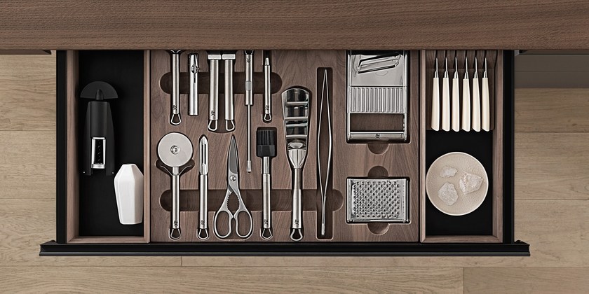
When opening the lid, the user is presented with a toolbox-like tray that orderly organises all the tools necessary to set up the pot.

“The analogy of the toolbox here immediately communicates the “learning by doing” philosophy of the product and invites users to make their hands dirty right away from the beginning.”
Moreover the analogy provides a feeling of order and clarity, to instil confidence in naïve users that approach gardening for the first time.
4 / Evoke positive emotions
Finally, metaphors and analogies can be a great way to change people state of mind by leveraging on other positive experiences.
I used this approach when I set to tackle one of the most stressful and anxiety-inducing things modern human beings experience multiple times a year: making gifts.
The challenge here was to find a way to help givers make great gifts without spending loads of time and energies, while, in the process, maximising enjoyment.
The result was Giftpick, an AI-powered Gift giving service that let givers quickly create bespoke collections recipients can choose their gift from.

“Giftpick leverages on the attributes of different analogies: the fun of personality tests, the excitement of gift catalogues and the warmth of hand-written cards to instil positive vibes into a typically negative experience.”
Ultimately, the use of analogies here helped turning gift-giving into what it should be: an expression of love and care for each other.
Conclusions
As humans, we experience products and services through different lenses, be it physical, cognitive or emotional. In a designer toolset, metaphor and analogies are key tools to influence perception across all lenses and induce desirable emotions and behaviours.
Moreover, defining metaphors and analogies early on in the process sets a powerful common vision that helps aligning all stakeholders involved in the product development process, creating a consistent product experience and a recognisable brand image, that will help the product sell itself without the need of cheesy claims.

